The True Power of Front-of-Package Labels
Relevant topics Archive, Advertising
There are only 24 hours in a day for us to get through our to-do lists. So how do we decide what to prioritize? Lucky for us, our brains use cognitive shortcuts to simplify decisions and cut corners. But here’s the catch: cutting corners has consequences. And when it comes to our brain, cutting corners leads to cognitive biases.
Cognitive shortcuts and packaged goods
Let’s look at shopping for packaged goods: we are usually pressed for time when shopping. And let’s face it: nobody really wants to read all the details on the back of packages.
Research shows that one third of product decision-making is based on the packaging alone and it only takes us seven seconds to make up our mind. This means products need to catch our attention first, and then hold that attention by converting it into a desire.
Study on front-of-package nutrition symbols
A study within marketing science was done on front-of-package (FOP) nutrition symbols and their effects on buying behaviors. The results were in favor of packages without FOP icons. However, the icons also provided evaluative components that helped consumers interpret the product, particularly when comparing products. While nutrition symbols can help us better understand the package, it doesn’t correlate with purchase behavior. They are most helpful when comparing to products with no nutrition information.
So, does it matter to communicate nutrition information on the front of the package? No, not necessarily.
Case: Juice Society
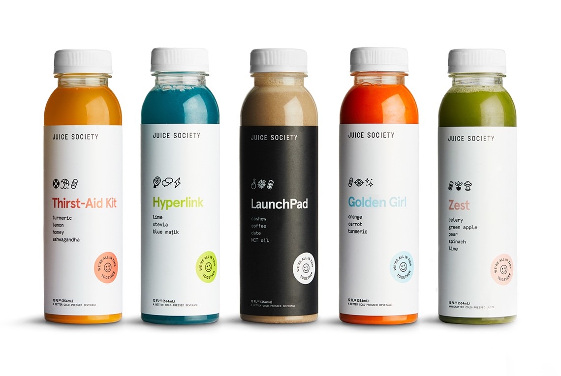
Juice Society is a wellness brand that offers beverages that are healthy and fun. When you look at their FOP labeling, it’s simple and to the point. For each beverage, they offer three icons that give you the summary of the drink, whether it’s for energy, eyesight, anti-inflammatory etc. Their packaging is always the same: beverage name, three symbols, the ingredients and a stamp with a winky face.
Their FOP symbols work because they are simple. They only have three symbols on each beverage that informs you what the drink is for. In addition, the symbols are visual pictures that are familiar to us, allowing our cognitive shortcuts to come into play. We use our memories and past experiences to better understand present challenges and in this case, knowing what the icons mean from our past will allow us to understand what the beverage is referring to. However, I personally would be more conscious about which icons to use for different audiences, since some of the icons are a bit confusing.
Next are the colors: each beverage has 2-3 colors on each labeling. While we may associate different colors with different feelings, their colors provide structure and focus. The human eyes process information with two type of neurons: rods and cones. Our cones help define lines, allowing us to read words and see edges. With a white background on Juice Society’s beverages, the ingredients pop out with the contrasting color in black – thanks to our cones! In addition, the beverage name and sticker in a third color offers a statement, telling our eyes where to focus on. The great part is that there is no other distraction on the packaging and all of this is happening on a subconscious level. So in this case, the icons help.
FOP symbols can be used strategically with the overall product design that uses the brain’s cognitive shortcuts in its favor, such as Juice Society’s design. In order to capture one’s attention, tapping into cognitive shortcuts can help lead a consumer to your brand. And like Juice Society’s design, your front of package needs to be easily digestible and relevant to the consumer’s life to ensure their initial attention.
Take home points
- Use 2-3 colors to help guide the consumer’s focus
- Use icons that your consumer will be familiar with, but be cautious of what the association is for their culture or background
- FOP icon influence can be optimized when our cognitive shortcuts are considered in the strategy

Newman, C. L., Burton, S., Andrews, J. C., Netemeyer, R. G., & Kees, J. (2018). Marketers’ use of alternative front-of-package nutrition symbols: An examination of effects on product evaluations. Journal of the Academy of Marketing Science, 46(3), 453-476
Further Reading
-
How brand stories on packaging influence consumer behavior and purchase intent
Once upon a time, our ancestors would gather around a fire to tell stories, sharing their imaginations and lessons with others. Fast-forward to today and we are still sharing stories, but accompanied by smartphones instead of fires.

