The size of colors: More intense means bigger!
Relevant topics Archive, Strategy
The rainforests in South America are being inhabited by several species of brightly colored frogs. These frogs are often poisonous and the bright colors serve as a warning to predators not to eat these frogs, because otherwise they might become sick or worse. So in this case, the information that the color conveys is very important for the survival of both the frog and the potential predator. Colors are all around us. Every object you will ever see has color and this is therefore one of the most important visual cues we have. Color conveys a lot of important information about the world around us and some of this information has interesting implications for the design of your call to actions and products.
Saturation influences size
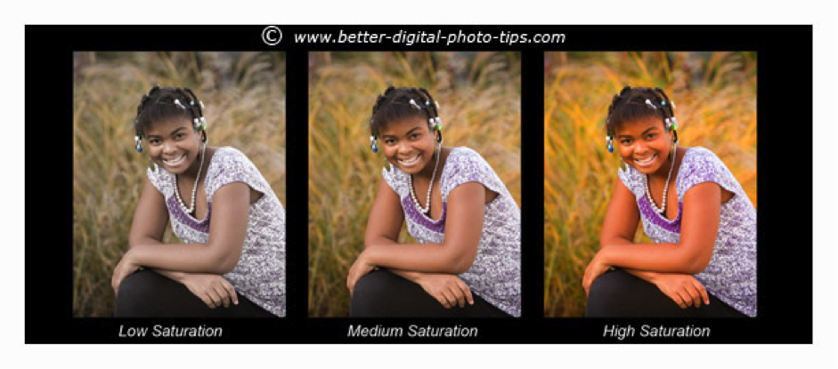
Apart from warning us not to eat poisonous frogs, color gives us a whole lot of other information, including information that is relevant for marketing. Colors are often described in three values. The first one is the hue, which describes the actual color, for example blue, red or yellow. The second one is the value, or brightness, which describes how light or dark the color appears. The last one is the saturation, which describes the intensity of the color, as shown in the image below:

Source: http://amazingphoto123.weebly.com/color1.html.
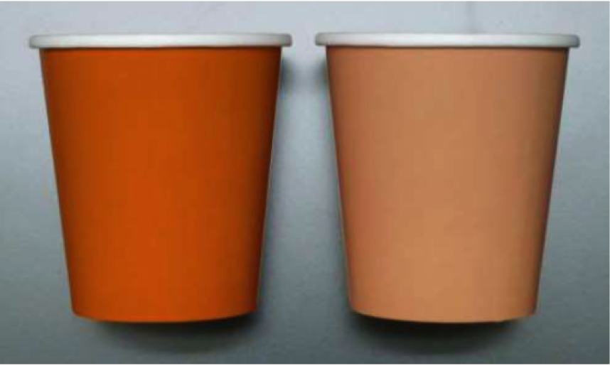
This saturation value has recently been found to have several interesting effects on other perceptions. This was discovered by Hagtvedt & Brasel (2017), who conducted a total of six experiments to test the effects of color saturation on the perception of the size of objects. In one of these experiments, the test subjects had to guess the size of two similar objects presented simultaneously, only differing in color saturation. More than 65% of the subjects judged the object with a higher color saturation to be larger than the size of it’s lower saturated counterpart. Another interesting find of the article was when the researchers made test subjects fill a cup with Jelly Beans in another experiment. What they found was that subjects put significantly more Jelly Beans in the cup when that cup had a higher amount of color saturation. This was because the high saturation made the cup appear larger in the eyes of the subjects, which made them pour more Beans in the cup to fill the ‘larger’ cup.

Source: From article Hagtvedt & Brasel (2017)
The researchers also found that the color saturation of an object does not only influence the size perceptions of the object itself, but also of its direct surroundings. When they showed test subjects a picture with an object in a room, the height of that room was judged to be significantly lower when the object's color saturation was high.
The amount of color saturation doesn’t just increase the apparent size of an object, but also the amount of attention towards it. The experimenters found that the test subjects rated the amount of attention they focused towards an object was significantly higher when the object had a higher color saturation.
These findings are already quite interesting, but it doesn’t stop there. The researchers also conducted an experiment in which they gave test subjects a shopping task. They gave their subjects the task to either look for a small suitcase that would easily fit in an overhead compartment or a large suitcase that could contain a lot of items. What they found was that when given the first task of finding a small suitcase, consumers would strongly prefer suitcases with a low saturated color and the other way around when they gave subjects the second goal. This was also combined with a higher willingness to pay (WTP) and more favorable evaluations for the bag that appeared most suitable for the task.
So from this we can conclude that a highly saturated color makes an object appear larger and makes the direct surroundings of that object appear smaller. A higher amount of saturation will also command more attention towards the object. People will also use this apparent size to judge whether a product or object will help them fulfill their task and will adjust their evaluations and willingness to pay accordingly. The reason for this curious effect has to do with psychological arousal, or the amount of activity in the brain. The researchers theorized that highly saturated colors generate more arousal, which in turn generates more attention towards the highly saturated object and causes the object to be judged as physically larger.
Newneuromarketing is looking for new authors! Are you up for the job?
Send us an e-mail at tim@newneuromarketing.com to become an author and start spreading knowledge.
Practical implications
These findings have several interesting implications, first of all for website designs and online conversion. The first implication has to do with the color of relevant sections of your site. Every site has certain sections that you want to direct attention to, for example the buy buttons in a webshop. By increasing the color saturation of these “Call to Actions”, you can increase the amount of attention that visitors will have for them. So if you want to direct more attention towards a certain section of your site, consider giving that section a more saturated color.

Also, you could change the color of your products. If you sell a product that needs to appear to be big, you might want to choose a highly saturated color to make the product appear bigger. For example, status related products often need to appear physically large to intimidate other people, so choosing a bright color for a status related product could be a good choice. Or choose a less saturated color if you want your product to appear smaller.

Source: https://mulpix.com/instagram/ferrari_488_gtb_yellow.html
This also has implications for advertising. For example, an online banner ad could appear bigger if you use highly saturated colors, which could make it more obtrusive and annoying. So if you want people to react less negatively to your ads, you might want to consider a less saturated color.
The experiment with the Jelly Beans mentioned above has another interesting implication for a wide range of businesses. For example, if you own a restaurant you might consider using plates with a low saturated color to make your guests think the plate is fuller. Or you might consider giving your food more saturated colors to make it appear bigger.
Reliability of color research
However interesting these results may seem, with color research it is always difficult to pinpoint exactly what hue or color value is being used, which might impact the reliability of this research. Furthermore, a color might appear differently on paper then on a screen. A color might even be displayed slightly differently across different screens. This is always something to keep in mind when working with color. In this particular article, the researchers replicated their findings across six experiments, thereby alleviating these concerns somewhat. In the end, it is probably best to just forget about these concerns and conduct one or multiple A/B tests to see if these findings work for you.
Take aways
- Give your call to actions and other relevant sections on your website a highly saturated color to direct more attention towards them.
- Give objects and products a more saturated color if you want to make them appear larger, or a less saturated color if you want to make them appear smaller.
- If your customers are looking for a large item, giving your products more saturated colors could increase the willingness to pay and lead to more positive evaluations. Conversely, if your customers are looking for small items, give the products less saturated colors to reap the same benefits.
Further Reading
-
How to set discounts for various related products
Chocolate bars, everyone has at least one in their kitchen cabinets, for those rainy evenings on the couch. Yes, (nearly) everyone loves chocolate, but some companies thrive and others…well…have a harder time trying to sell their chocolate bars.


