Conversion
Restructure your CTA with this simple technique and more than double your conversion rate

Get ready. You’re about to discover a simple to use scientifically grounded technique that has increased conversions by 40% to as much as 125% percent.
It’s not about button color, shape or size. It’s not about adding extra pieces of persuasive information. It’s not about clever page design. It’s simply restructuring the way people can accept or decline your call to action.
Say yes to the ‘no’ button
In recent years, the topic of response formats in persuasive design has captured the attention of research in the neural and behavioral sciences. More specifically, researchers investigated whether the standard opt-in format (“Download ebook now”) could be beaten by a forced choice structure consisting of both a yes (“Yes, I want this ebook”) and a no (“No, I don’t want this ebook”) option.
A nice pile of scientific studies – and even more online A/B tests – affirms that this clever format often does a better job at getting clicks and conversions. Conversion rates have more than doubled by simply splitting up a single call to action into two options. The technique is especially useful when a call to action refers to a single action that can be taken directly, such as downloading an ebook, subscribing to a newsletter, enrolling for a course or ordering a product.
Why does the forced choice structure work so well?
Being the natural people pleasers and regret averse individuals that we are, it’s hard for us to downright say to have no interest in whatever someone is offering us. Humans are born with a reluctance to say ‘no’, either for social reasons or for our aversion to forego an option forever.
When engaged in face-to-face communications, our preference for hearing someone out before throwing the door in his face is especially evident.
In the online realm, despite users being shielded in anonymity, this psychological principle still holds. Not clicking on ‘yes’ is psychologically less taxing than actively clicking on ‘no’. It’s here where the effectiveness of the forced choice paradigm lies: it injects the pain of saying no into the choice equation, thereby prompting more people to say yes.
Forced choice on steroids: the emphasis technique
The effectiveness of the forced choice structure can be boosted even further by emphasizing what each option means to your visitor.
Let’s say you’re browsing the web for information about getting leaner and more muscular. After reading some blogs at different websites, suddenly the following call to action pops up:
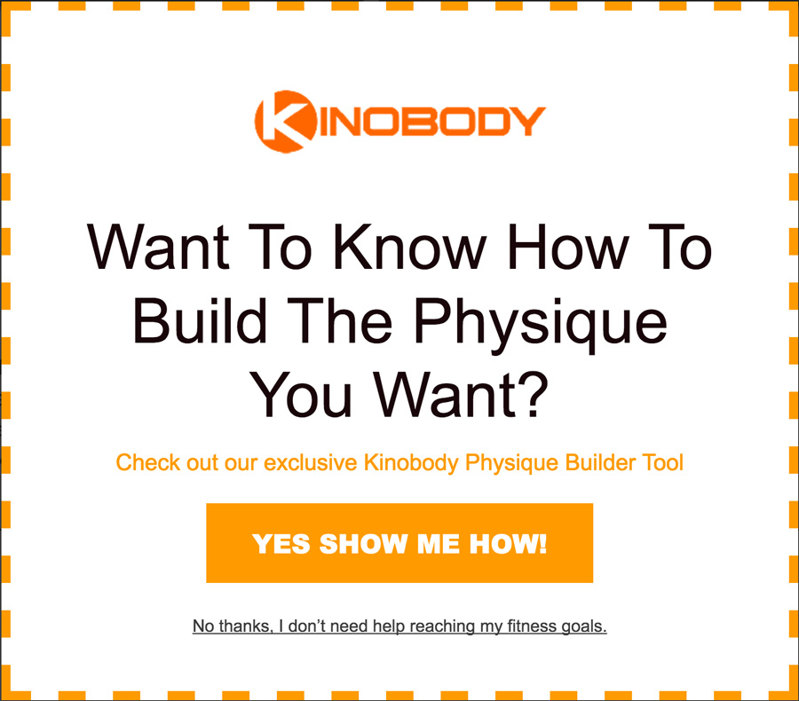
What’s interesting about this piece of persuasive copywriting, is that it employs the forced choice texture while emphasizing the negative consequences of choosing no. For someone who’s obviously in search of fitness information, it doesn’t feel right to say no. The research shows this extra information further increases clicks and conversions, as it makes people regard the positive aspects of the request even more.
While the example above is still respectful, some communicators crank this principle up to new heights of impertinence. I’ve seen pop-ups going as far as stating “No thanks, I’m fine with being flabby and having no muscle tone, and don’t care about having a girlfriend either.” Now, who dares clicking that?
Where are the limits of forced choice options?
Research shows that the yes/no choice structure is often the best way in getting people to click on the CTA button. But clicks are not conversions.
Indeed, in some cases the final conversion rate steeps at about the same place as standard call to action formats. This seems to be caused by a disproportionate number of unconsidered clicks that are attracted by the yes/no condition. People’s avoidance of ‘no’ may cause some to blindly hit yes, which they quickly set straight as soon as they see the indecent proposal on the next page. In general, the forced choice technique tends to increase clicks more than it does conversions.
Still, this means that in many cases the yes/no structure does result in an increased conversion rate down the line. The determining factor here seems to be time; the gap between the moment someone clicks on a CTA button and the actual conversion. This makes it a great starting point for many simple online conversion funnels in which people can basically click, fill in their information and complete their order.
Forced choice is already prevalent in pop-ups and on single-CTA websites. However, they remain a rarity among regular e-commerce sites selling their diverse catalogs of products. It would be interesting to find out how the technique pans out on a regular product page. Instead of merely tempting the visitor to hit ‘Place in cart’, we would split the CTA up in the two options of ‘Yes, I want to place this in my cart’ versus ‘No, I want to look at similar products’.
That single cart button is getting a bit lonely on its own after all those years, don’t you think?


