Beyond the Taste Buds: How Packaging Shapes Our Perception
Relevant topics Archive, Conversion
If you're a food lover, chances are you've been lured by a mouth-watering package design at least once. But did you know that the shape and color of packaging can also affect your perception of taste? The days where the sole purpose of a product’s packaging was to protect its content are over. As visual creatures, we often base our purchase decisions on the visual appearance of products. That’s why packaging plays a key role in setting product-related expectations. Packaging design can communicate a product's quality, value, and taste, which can influence consumers' purchasing decisions.
But how exactly can packaging design influence our taste expectations of food and beverage products?
When senses collide
Cross modal correspondences are not a new phenomenon. We’ve known about this interconnectedness of our senses for a long time.
You may have heard about the Bouba-Kiki effect. The effect describes the tendency for people across cultures to associate the rounded shape of the Bouba with a soft, smooth sound, and the angular shape of the Kiki with a sharp, jagged sound. This correspondence between shape and sound is just one of the many cross modal correspondences that exist between different sensory modalities, including taste, smell, and touch.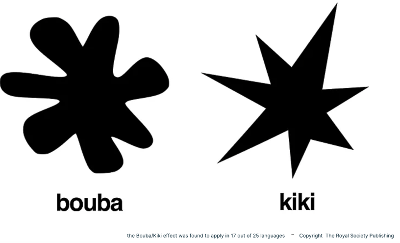
Another example of cross modal correspondence is that we often use shapes when describing the taste of food or drinks. For example, wine is often described as having some sort of shape, like round or sharp.
“With each sip, the wine's bold and angular flavor profile cut through the richness of the meal.”
"As I savored the wine, I couldn't help but imagine the taste as a round, plump berry bursting with juicy sweetness.”
The same happens when people describe cheese:
"The cheese had a velvety, rounded texture that coated my tongue like a smooth, creamy sphere."
"With each bite, the sharpness of the cheese sliced through my palate."
Enhancing consumers’ taste expectations through packaging
A recent study by the Norwegian Business school reveals how packaging design in the competitive world of food marketing plays a crucial role in attracting consumers' attention and influencing their purchasing decisions.
The study specifically focuses on the shape and color of cheese packaging and their impact on consumers' taste perceptions. It reveals how the connections between senses are at work when looking at food packaging.
Shaping perception
In general, sharp and angular shapes evoke a sense of energy, toughness, and strength, while rounded shapes are associated with approachability, friendliness, and harmony. Angular shapes are linked with the words bitter, salty, and sour. Whereas sweetness is more linked to rounded shapes.
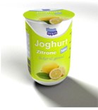
Suppose the same citrus-flavored yogurt is sold in a version with round packaging and in one with a rectangular shape. However the content is the same, chances are high that consumers unconsciously will perceive the rounded package as more sweetened and the rectangular package as more sour.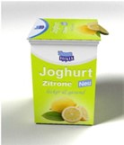
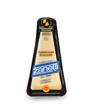
There are similar findings for cheese. It seems that people associate round and organic-shaped cheese packages with a milder and creamier taste, while angular and asymmetrical shapes were associated with a stronger and more intense taste. This means that a cheese with a mild flavor profile would benefit from being packaged in a round or organic-shaped package to reinforce consumers' expectations. Think about how Brie is often offered in round, wooden boxes and how an old, salty cheese like a Parmigiano Reggiano often has a triangular package.
Tasting the color
Similarly, the color of packaging can also affect our taste perceptions. Humans make associations with packaging color on three different levels: physiological, cultural, and brand associational. It’s this third level, the associative network that’s sparked by the brand, which we can influence. Often a certain color of packaging reminds us of a certain brand: blue- Barilla, purple – Cadbury, red-Coca Cola. But we also associate color with price categories and quality. If you want to market a fancy cheese, it’s wise to choose colder and darker colors for your packaging since it indicates premium quality. In contrast, more accessible products, like private labels, directed to more price sensitive consumers could benefit from brighter more white colors.
Color has a lot of power in low-involvement decisions like buying cheese. When talking cheese, the studied revealed that blue (or darker) packaging is associated with a stronger and saltier taste, while yellow and more beige packaging was associated with a milder and creamier taste. This means that cheese manufacturers can use packaging color to signal specific taste characteristics of their products to consumers. Remember how the packaging shape of Brie and Parmigiano Reggiano often matches the taste? The same is true for color. Brie is mostly served in a beige box, while Parmigiano mostly has dark blue are black in it’s packaging.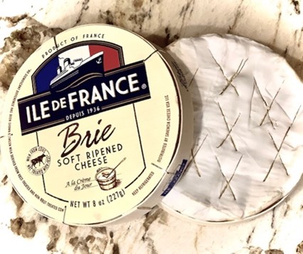
 The study's findings have significant implications for the food industry and suggest that packaging design should be an essential consideration in food marketing strategies. By carefully designing packaging to signal specific taste characteristics, manufacturers can influence consumers' taste perceptions and ultimately drive purchasing decisions.
In conclusion, next time you're browsing the cheese aisle, take a closer look at the packaging. The shape and color of the package may be trying to tell you something about the cheese inside. So, go ahead and let your taste buds be guided by the packaging design!
Cultural and contextual watch-out
- Some cross modal correspondences may be more subject to people’s cultural background than others. For example the meaning of color varies across cultures, geographical regions and the context it is seen in. Take Burger King, they introduced black burgers in Japan, and they brought the same burgers to America for Halloween. In Japan, they’re a hit. In America, not so much. Because America sees the color black as a negative color. Not too appetizing. But in Japan, black foods are much more common and aren’t seen so negatively. They associate brighter colored foods as being an obnoxious Western thing.
- Cross modal correspondences can also be influenced by usage occasion. For example, certain cheeses are for daily use, other are more likely to be used for festivities or get-togethers. Further research should dive into the possibility that consumers value different sensory cues in packaging according to the different buying situations they have in mind while browsing the supermarket.
Take-home points
When building food marketing strategies, it’s interesting to consider designing a packaging that signals a specific taste.
A few things to keep in mind while doing so:
- Find out what taste attributes best describe your product and the products you compete with.
- Choose one taste attribute you really want to communicate.
- Research, by looking at the literature, what sensory attributes of the packaging are associated best with the taste. Think about color, shape, but also texture or smell.
- Test designs of the packaging to check how different attributes influence expectations of taste and liking in order to find the design that best communicates the desired taste.

Veflen, N., Velasco, C., & Kraggerud, H. (2022). Signalling taste through packaging: The effects of shape and colour on consumers’ perceptions of cheeses. Food Quality and Preference, 104, 104742. https://doi.org/10.1016/j.foodqual.2022.104742
Further Reading
-
Let your eyes feast on this! How visual packaging elements change taste expectations
The purpose of food packaging has evolved a lot from what it used to be. At first, packaging was mainly used as a means to preserve and transport food items. Later, it was used as a way to gain consumers’ attention in shops and influence their preferences. More recently, a growing interest has been placed on how packaging can contribute to the multisensory experience of consumption.
But how come that something like packaging, which does not objectively alter the actual taste of food, can have so much impact? Let’s delve into how visual elements on food packaging can change taste expectations!
